top of page
Colour Theory Research Project
Introduction
“In order to use color effectively it is necessary to recognize that color deceives
continually”. Josef Albers (2006, pp 15). This research project endeavours to
explore colour and colour theory in the modernist period of art history (1920 –
1970), particularly focusing on its use and exploration by influential artists such
as Kandinsky, Mondrian and Anni and Josef Albers. This paper outlines
modernism and colour theory, analysing examples of colour art from prominent
artists and theorists while explaining their working methods, and evaluating
sources relating to modernist understandings and use of colour, and the effects
modernist colour use plays in contemporary art.
This paper analyses modernist influences on contemporary art, before
concluding with a reflective analysis of a modernist inspired body of work
exploring differences in identically named colours between paint brands.
Project type
Practical self-lead Research Project
Date
2025-26
Location
Paisley
Research Project Findings and Conclusion
Inspiration for Comparing the Same Paint Colour from Different Paint
Brands
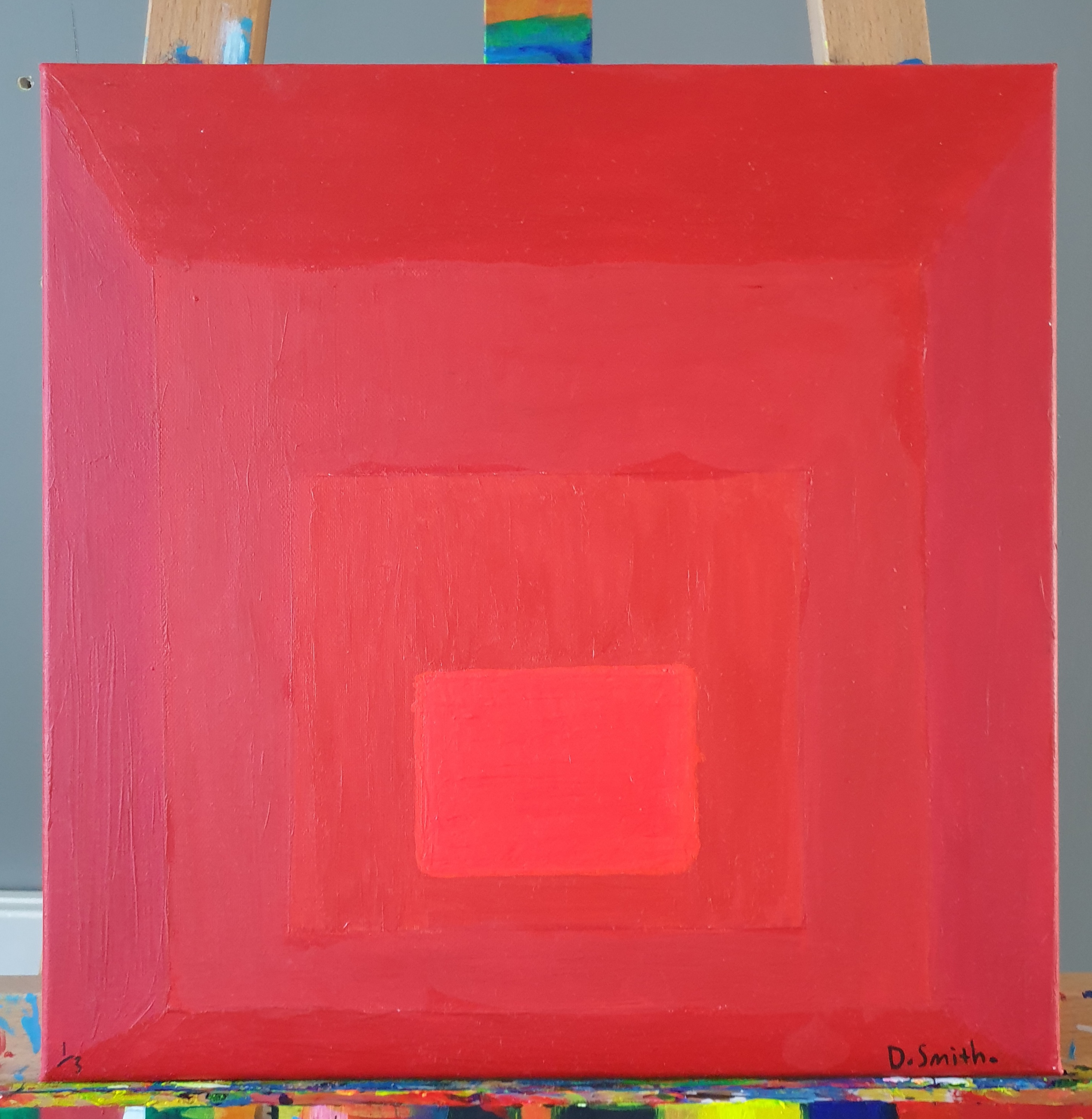
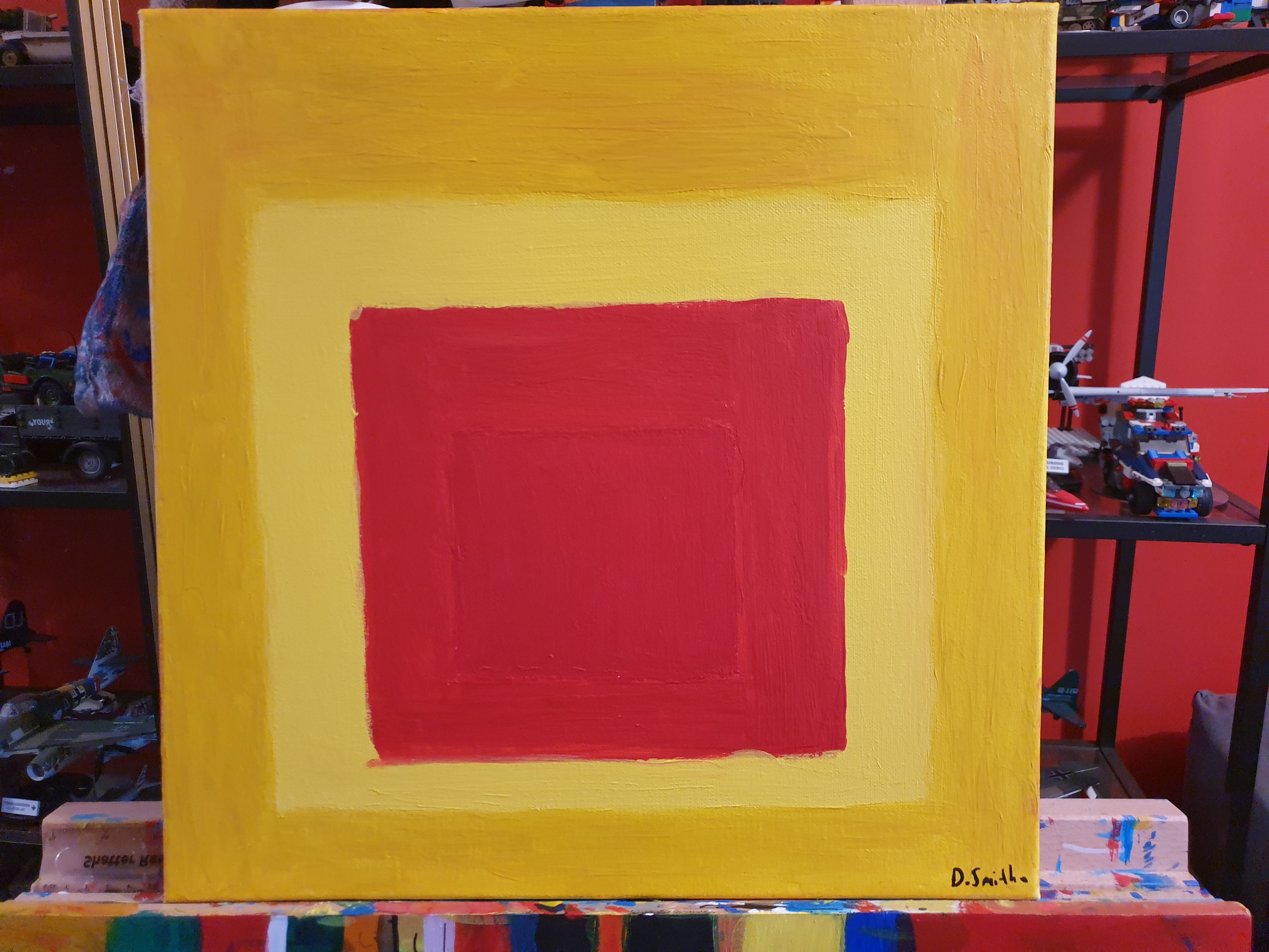
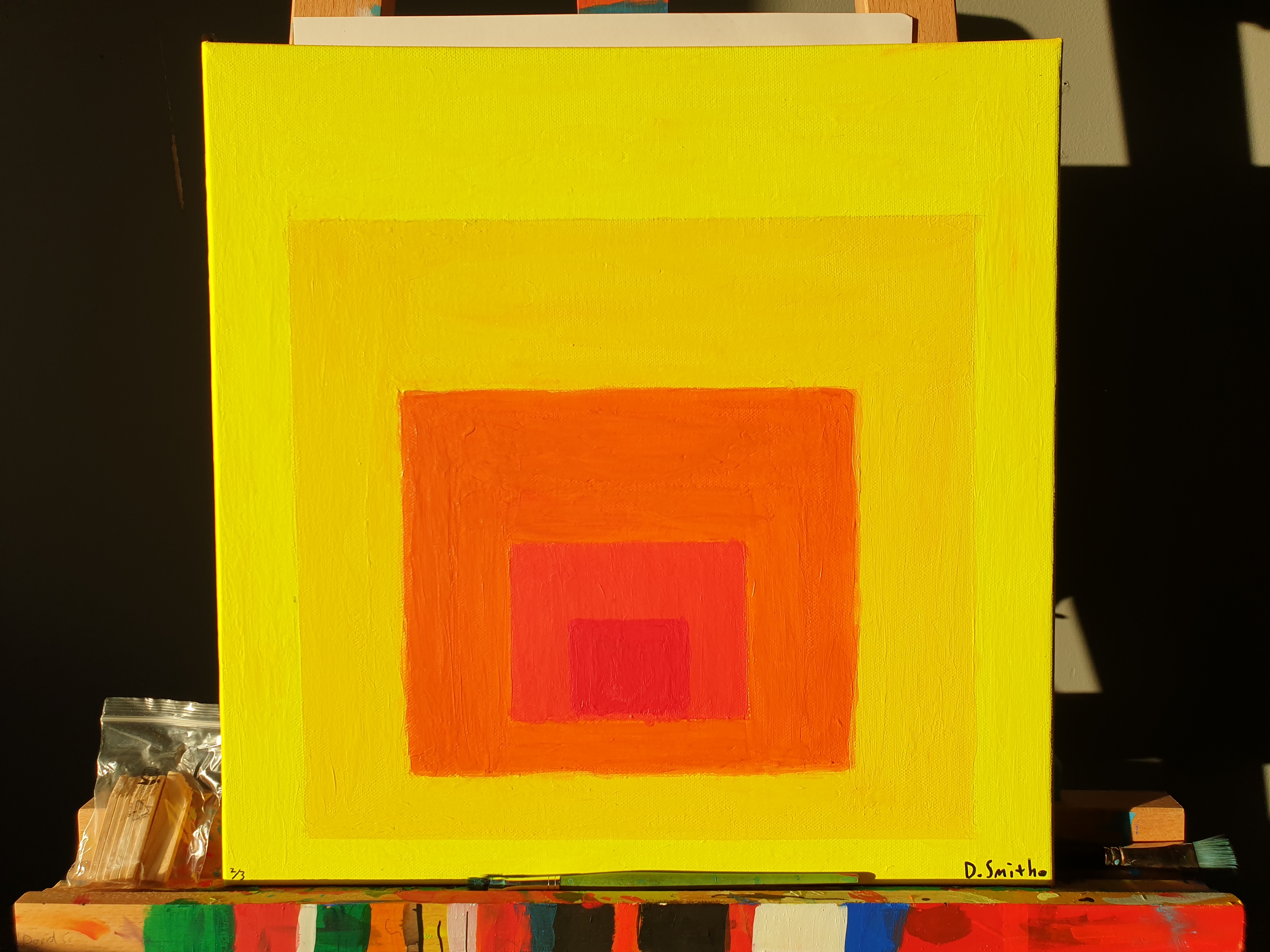
The first two paintings are the inspiration behind this project but still exploring
how colours interact. After painting Fig 22, I noticed a peculiar aspect of this
work. The Fluorescent Red (Daler Rowney) of the centre square becomes
visually prominent in low or indirect light, becoming the focal point of the
composition. But when the painting is in direct sunlight or artificial light, it
recedes into the painting, allowing the square surrounding it, Cadmium Orange
Hue (Cass Art), to jump out at the viewer. This effect is a testament to how
colours influence each other and react to environmental changes. The fluid
nature of red can be summed up by Josef Albers himself when he wrote;
"If one says “Red” (the name of a color) and there are 50 people listening,
it can be expected that there will be 50 reds in their minds. And one can
be sure that all these reds will be very different". – (Albers 1963, p3).
The second piece is the most visually pleasant to look at, with the brightest and
darkest colours balancing each other. The small dark square in the centre was a
later addition to the piece to add more contrast to the overpowering brightness
of the fluorescent paint that sometimes made the painting visibly glow when in
direct sunlight.
Comparing the Same Paint Colour from Different Paint Brands
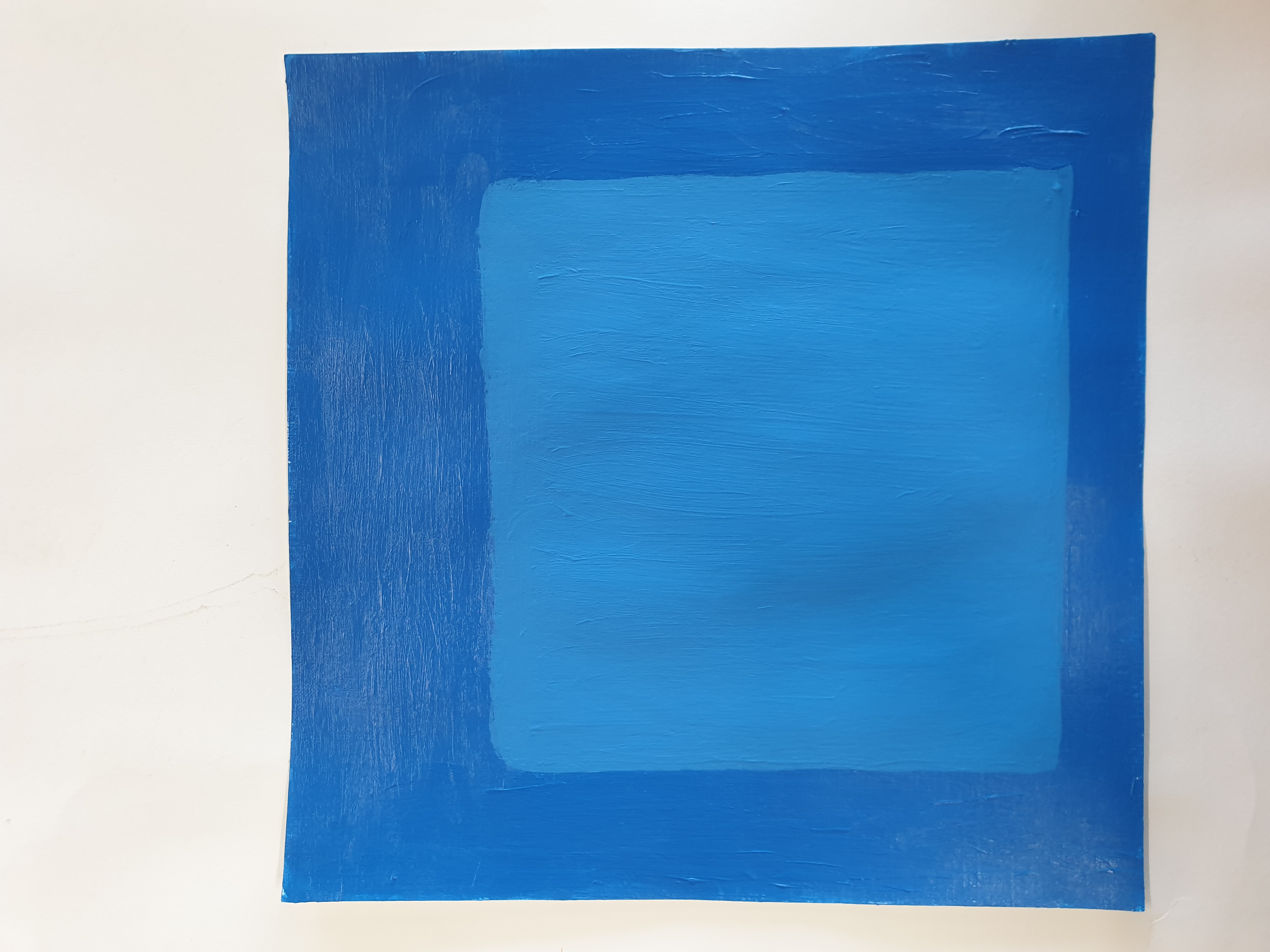
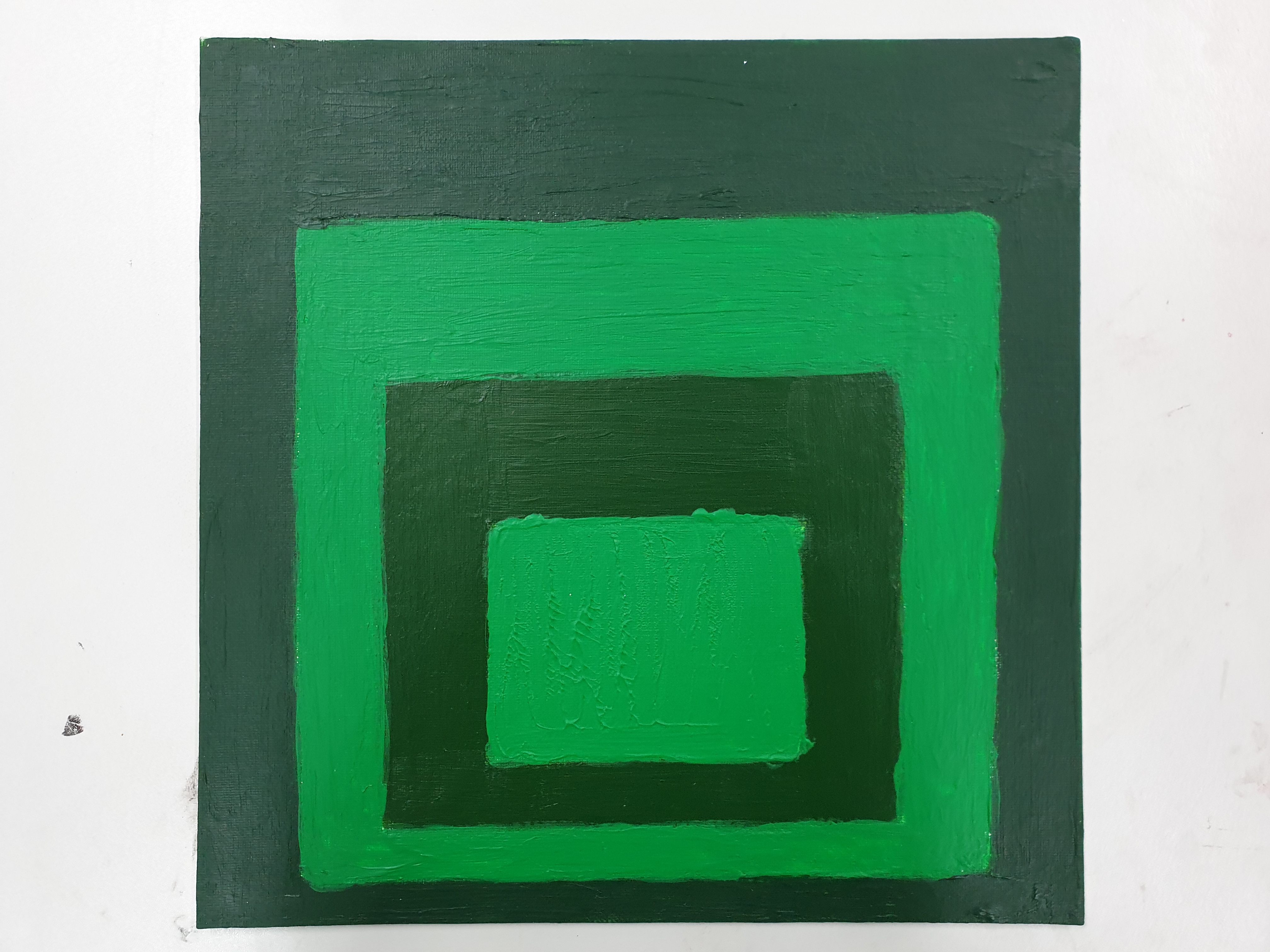
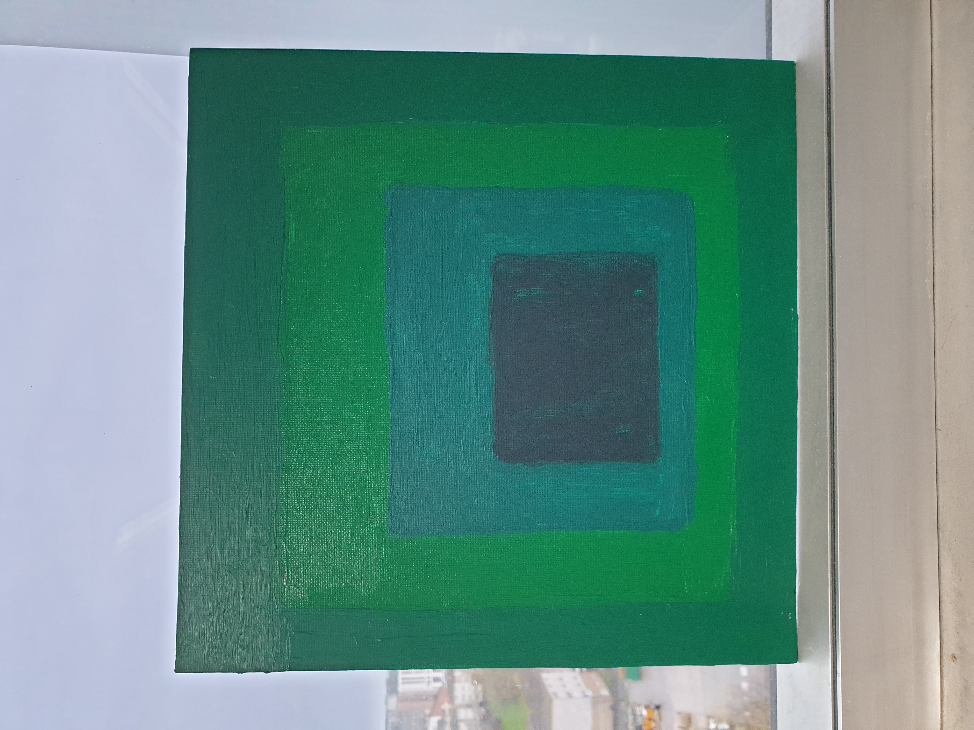
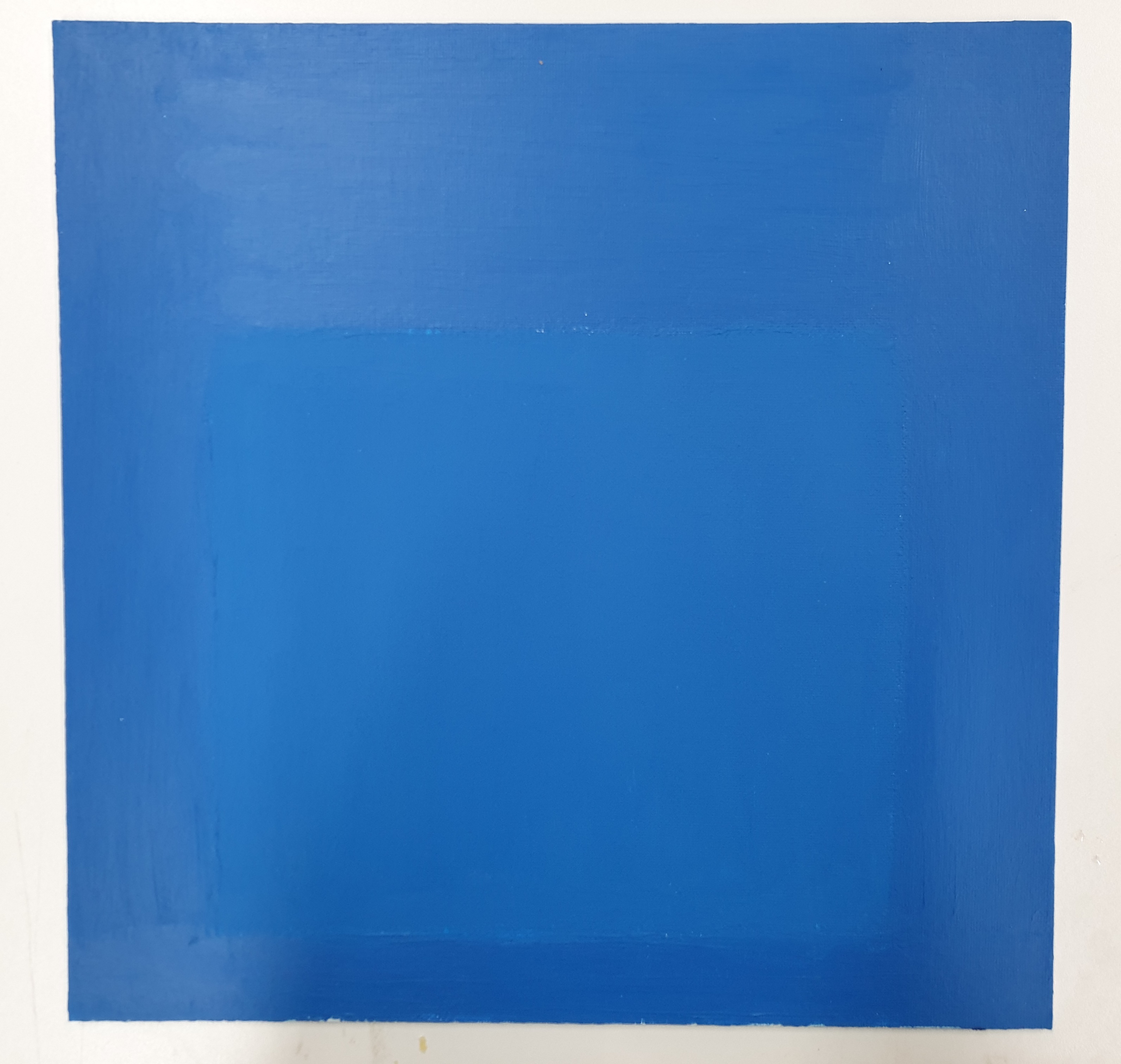
The making element of this research began as a simple exploration of the
colours I used the most, using the square painting format I appropriated from
Josef Albers after I became fascinated with him when I read his influential book
Interaction of colour 50th anniversary edition (Yale University Press, 2013).
These paintings were made over the summer and were intended to give me a
better understanding of the Homage to The Square (Albers 1950-1976). Taking
direct inspiration from this series.
I first came up with the Comparing the Same Paint Colour from Different Paint
Brands series after the first two paintings, after noticing I already had many
identically named paints from different brands, but never used them in one
painting before. I had the idea to make this colour experimentation the main
body of my practical work as it is something I am curious about, and that is
adding a new body of practical research to the realm of colour theory, a new
original body of contemporary artwork inspired by the work of Josef Albers.
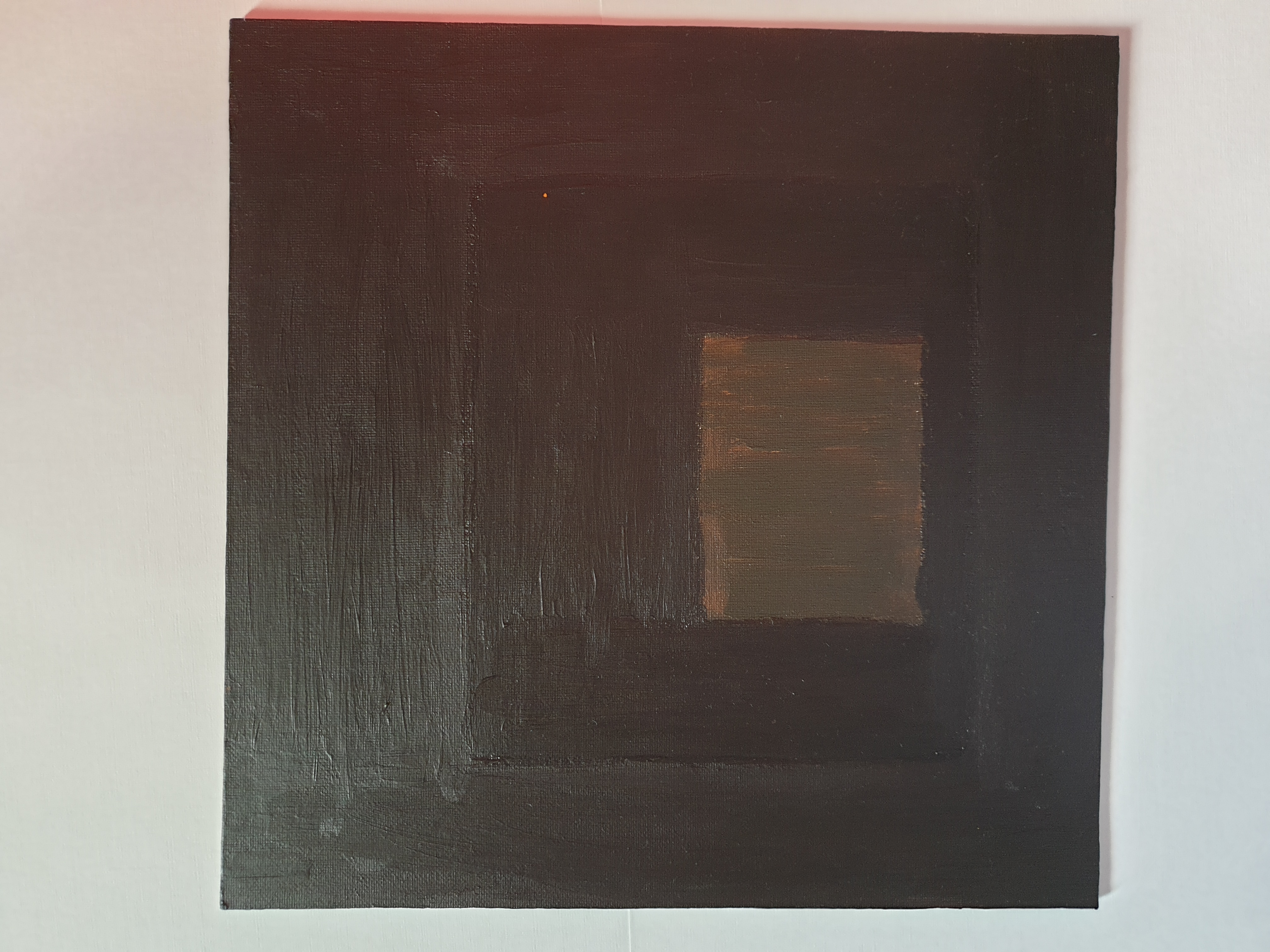
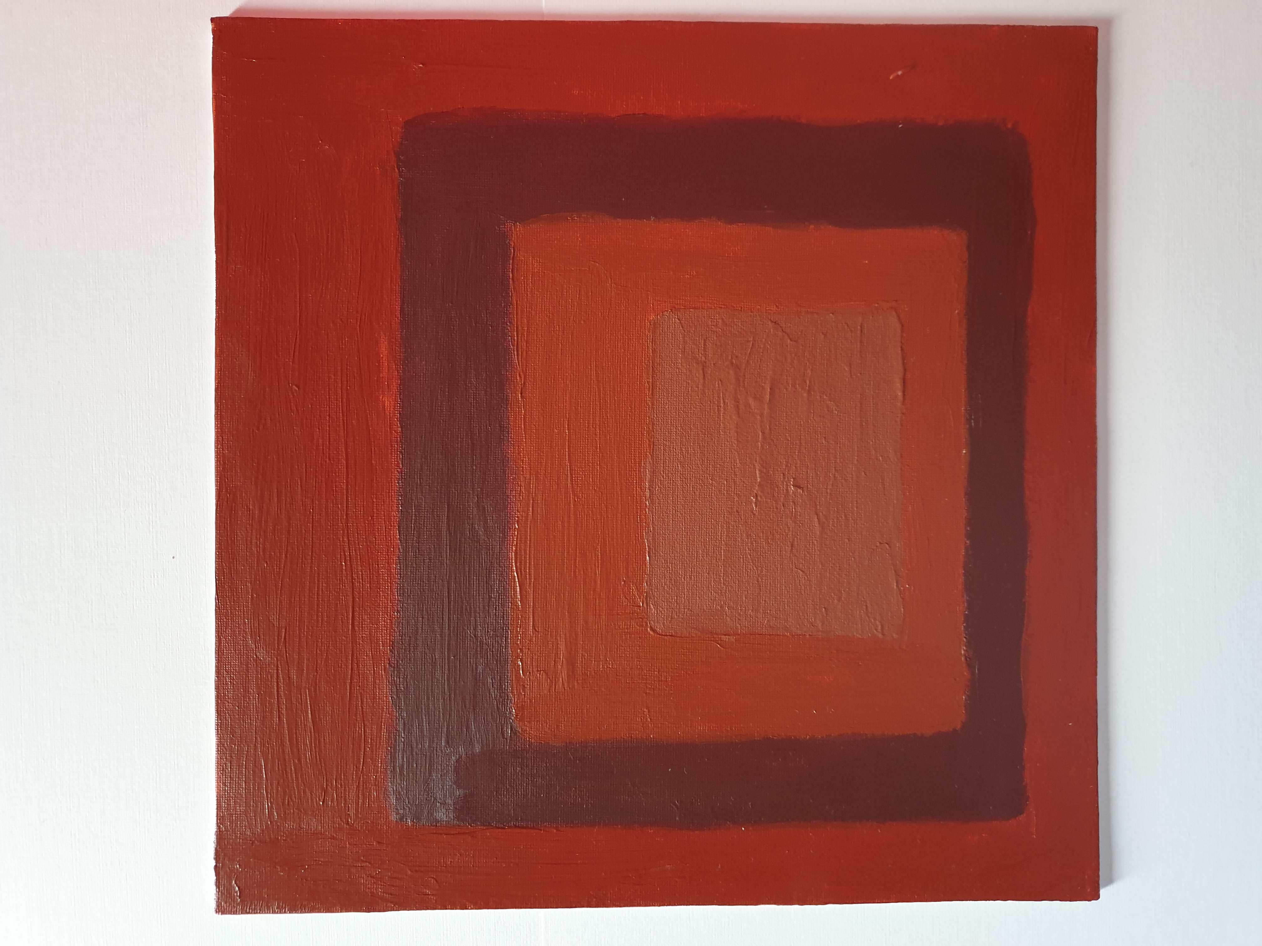
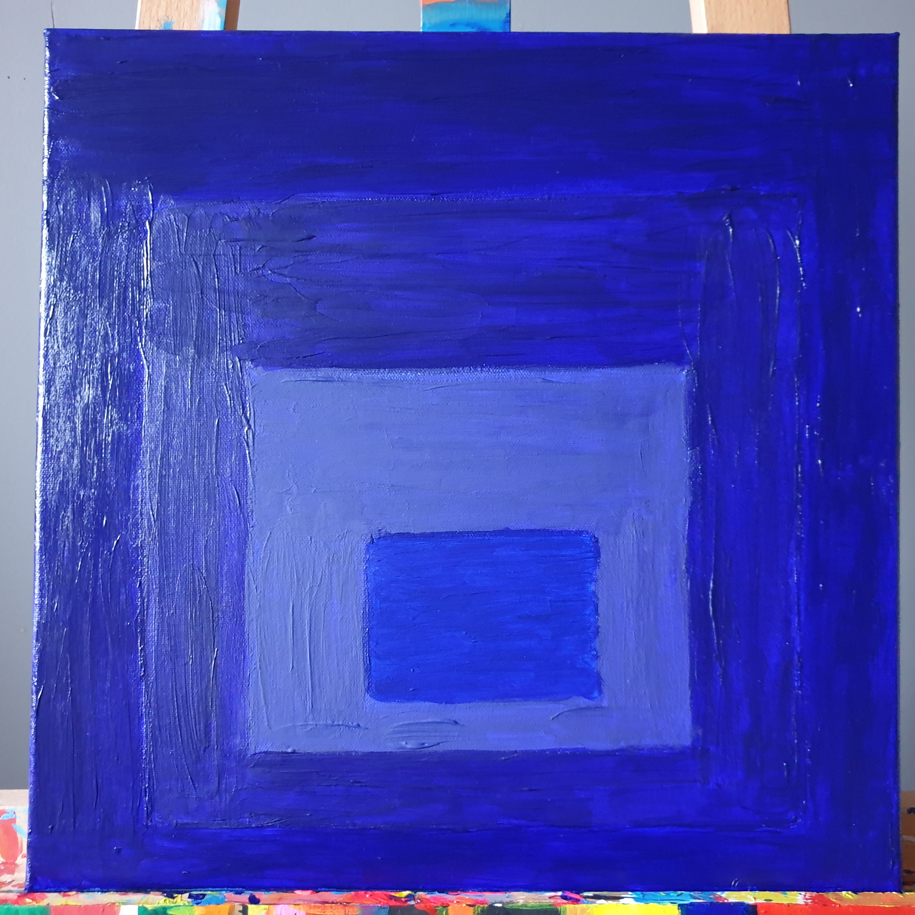
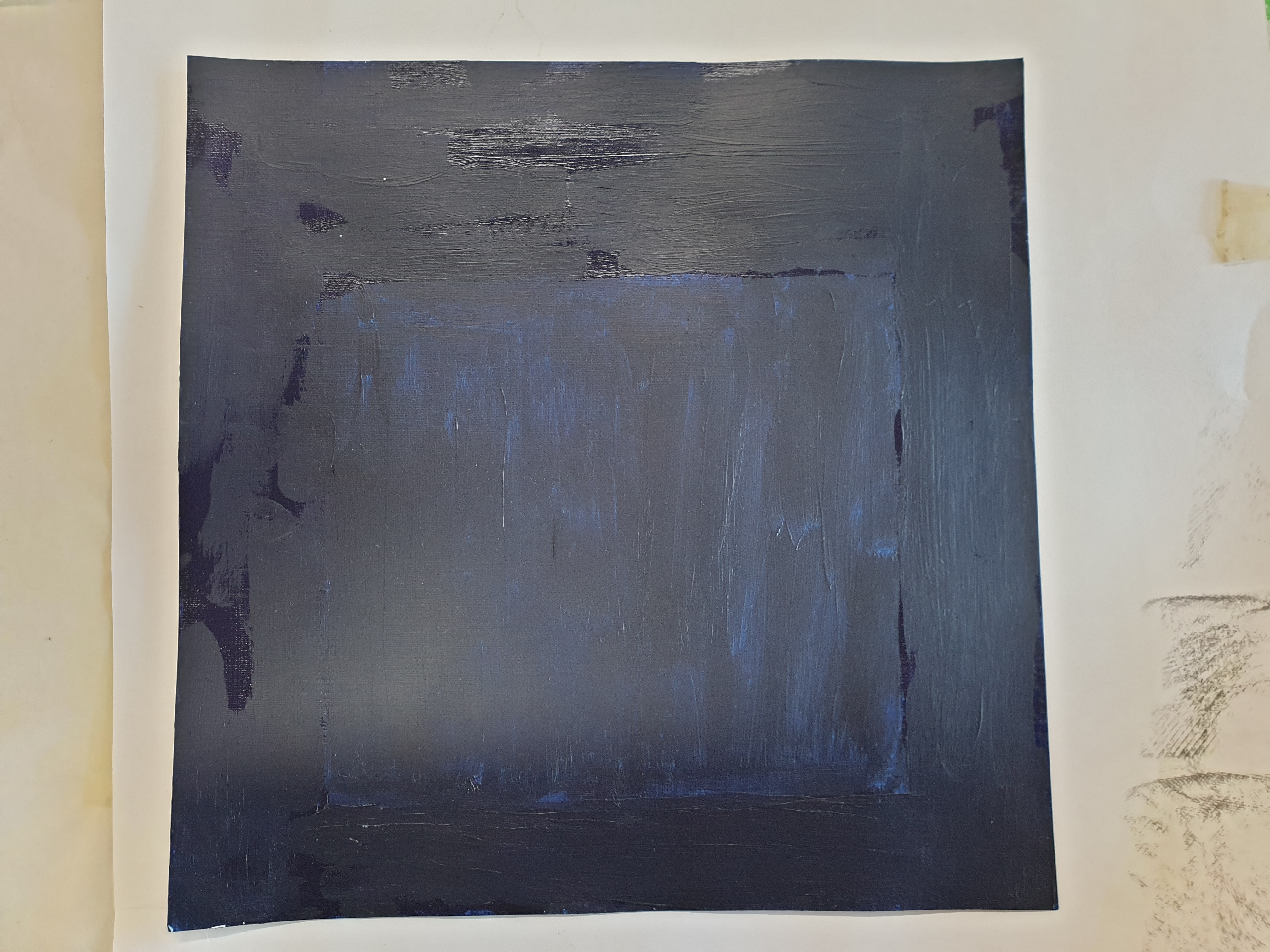
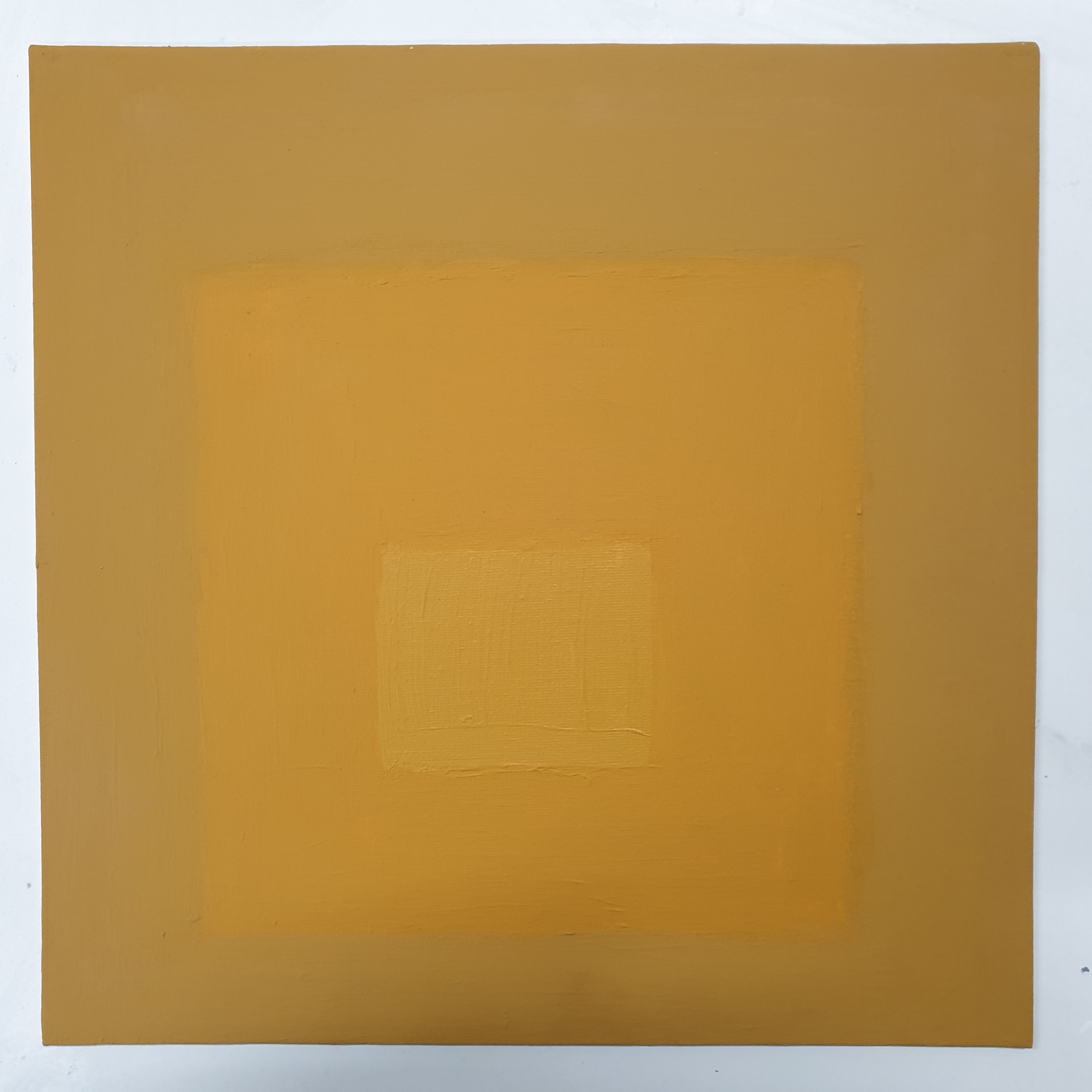
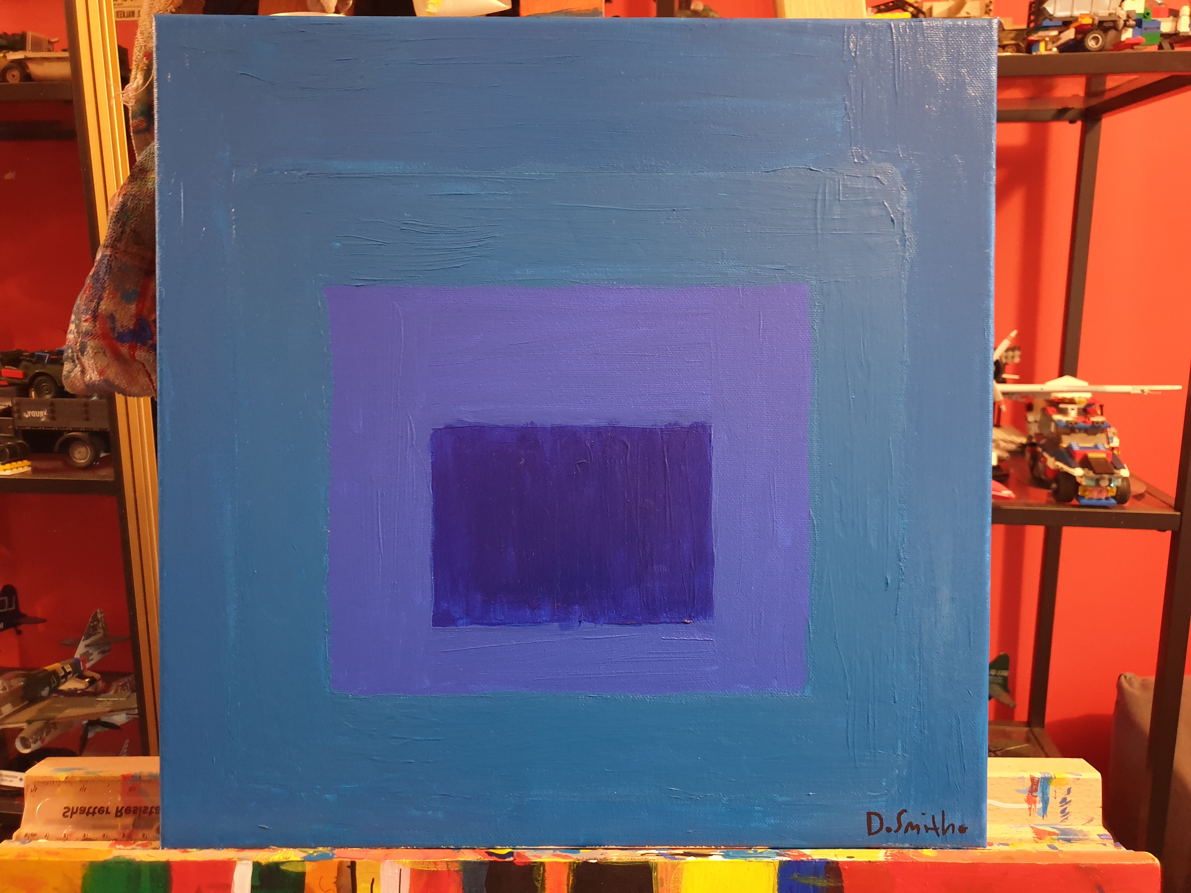
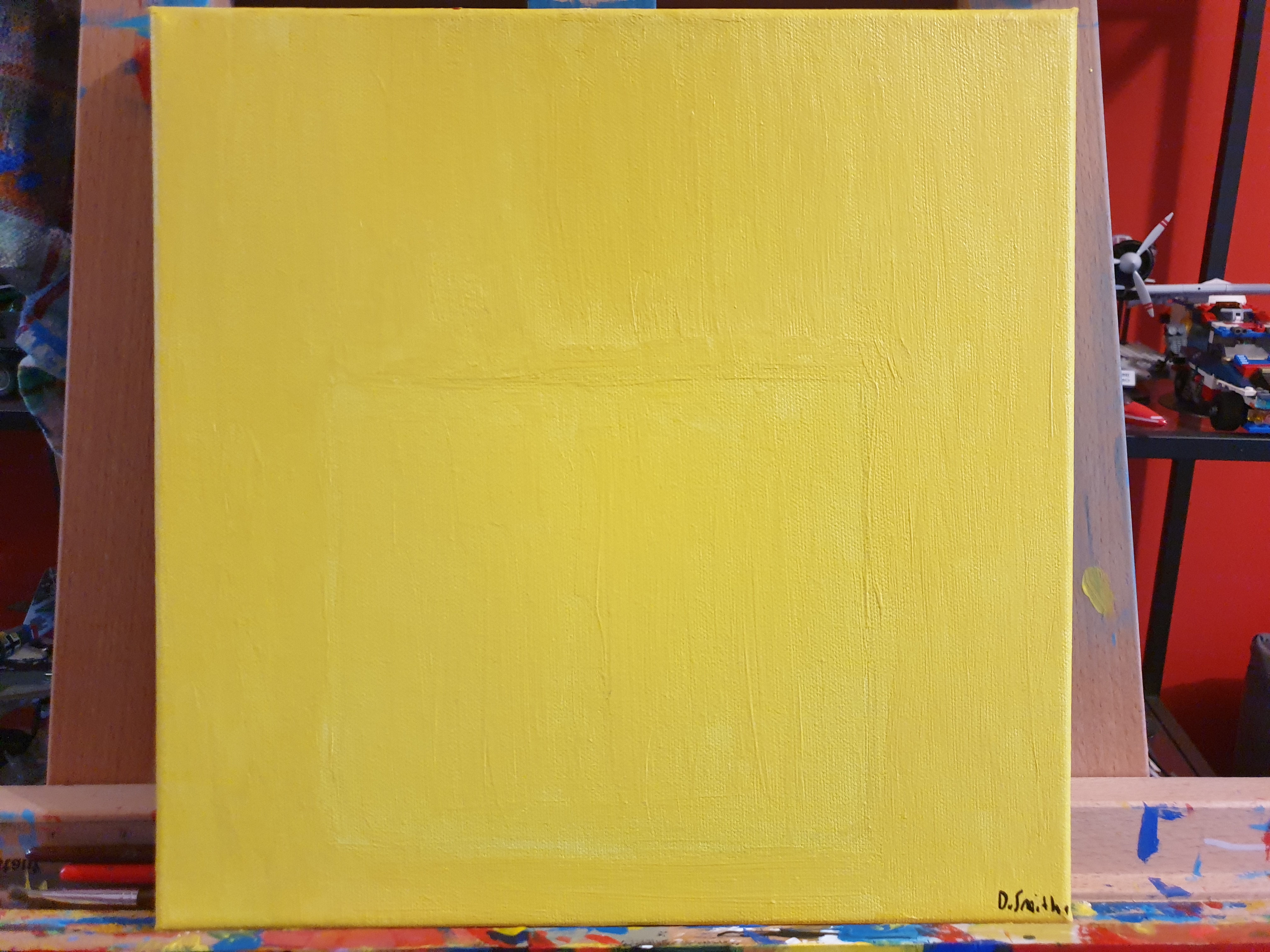
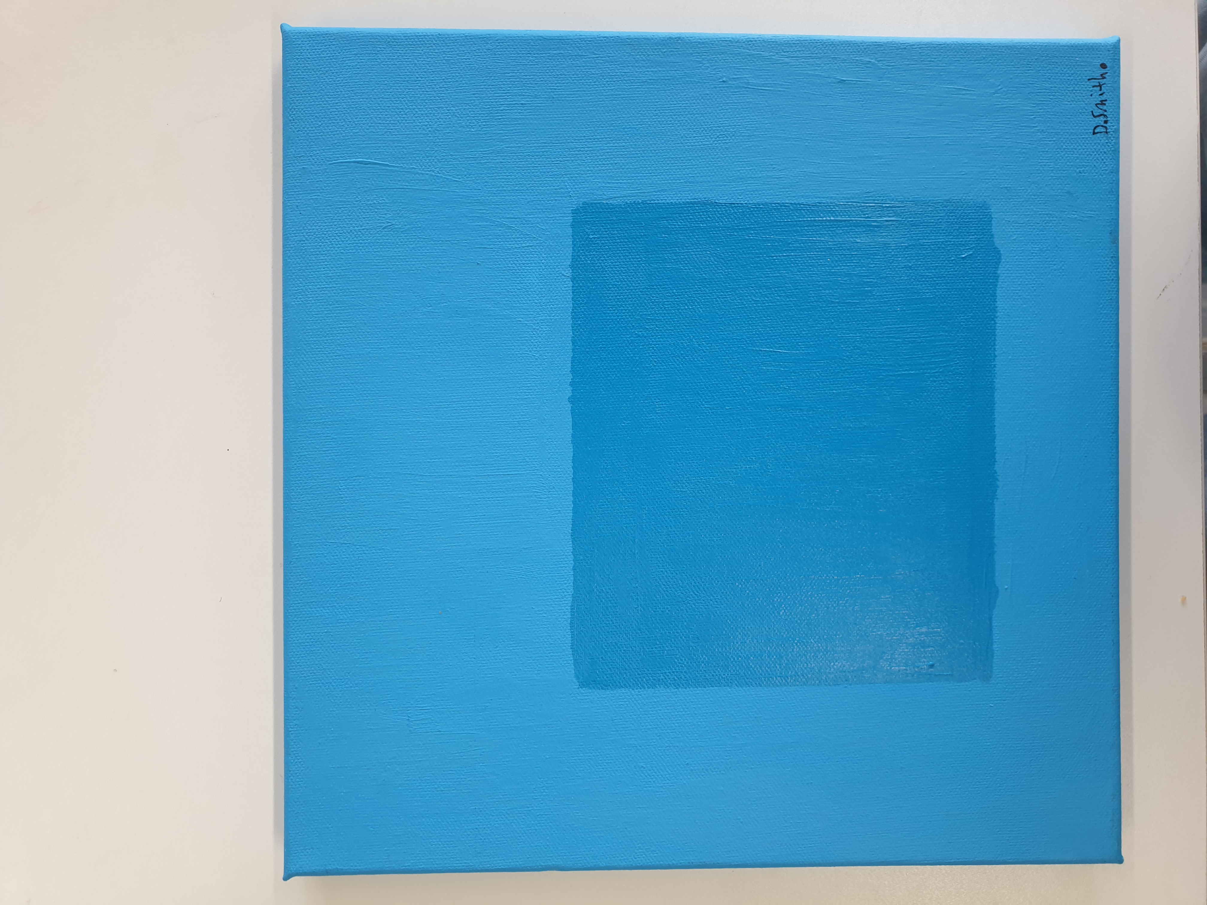
They are named from the colour and brand of the outermost square to the
centre square colour and brand, as I painted them from the exterior square to
the centre square, opposite to how Albers did his. The process of choosing
where each colour is placed in the square structure depended on the size of
each paint bottle, how the colours looked was left to chance. The comparison of
the colours of many paintings gave surprising results, and others were predicted
as soon as I started painting.
During my research, I found that Cass Art paints are darker than their peers,
and that both Daler Rowney and Cass Art paints can sometimes be shiny,
layered many times, as they are also opaque. Their large bottle size allowed me
to use them in the outermost sections in most paintings, smaller size paints
were used in the centre squares.
The interaction of the colours dictates whether works are aesthetically pleasing
to look at or not. I found the company with the opaque paint used in this project
was Pebeo. While the most vibrant paint company were the Liquitex paints, with
Daler Rowney being a close second. These discoveries have taught me which
paint companies are best to use in my bright colour palette, and what paints are
worth their money or not. With the Cass arts paint line, while the bottles are big,
many performed below my expectations compared to Daler Rowney and
Liquitex. The Acrylic Colours set was a starter set I had for years. It did well
compared to its peer brands.
Piet Mondrian inspiration
48
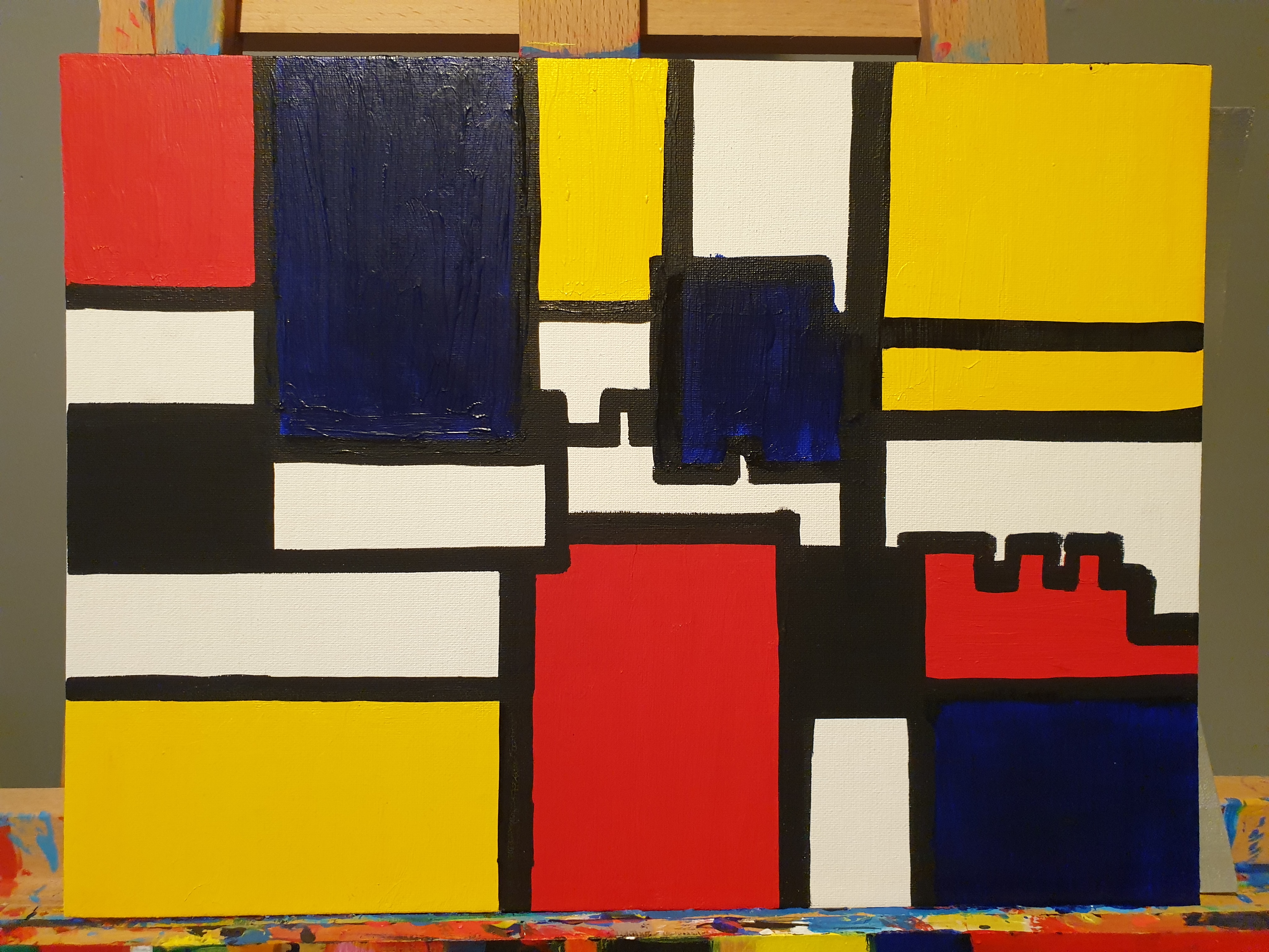
Piet Mondrian’s work has always had a special place in my love for colour,
coming from when I took a lot of inspiration from it in my formative years as a
painter, where I began to utilise geometric shapes of primary colours outlined in
thick black lines to develop architecture compositions I was studying. My best
paintings from this period were directly or indirectly inspired by Piet Mondrian.
My fascination was rekindled when I saw his work in the flesh at the Tate
Modern during my trip there as part of my college course. As a supplement to
my practical work. I decided to revisit this inspiration with new knowledge and
experience, based on my final Mondrian work from my HNC, made from two
traces of Carlisle Castle’s entrance.
Conclusion
My practical work was inspired by the work of Josef Albers. By making the
paintings in this way, I achieved my goal of demonstrating colour differences of
the same paint name across different brands. learning the luminosity,
consistency and opaqueness of each brand. I learned first-hand how the
colours environment affects how they interact with one another.
This body of work only scratched the surface of comparing the different brands'
versions of the same colour, this project could have continued forever until all
colours by all brands are compared. I already had many of the paints in this
project, many more were purchased for the project as it progressed. I believe
these square paintings demonstrate the radically different interpretations of the
same colour from each examined brand.
My work, inspired by Piet Mondrian, was supplementary to this project. Based in
reignited nostalgia for my early paintings. It functions well as a supplement to
the Albers practical research element. If I could have done this project
differently. I would have gone on a bigger scale than 30x30cm for most
paintings. I chose this scale as it's all I could find for a reasonable price. I would
include other brands and oil paint as well.

01
Colour Theory Research Project

01
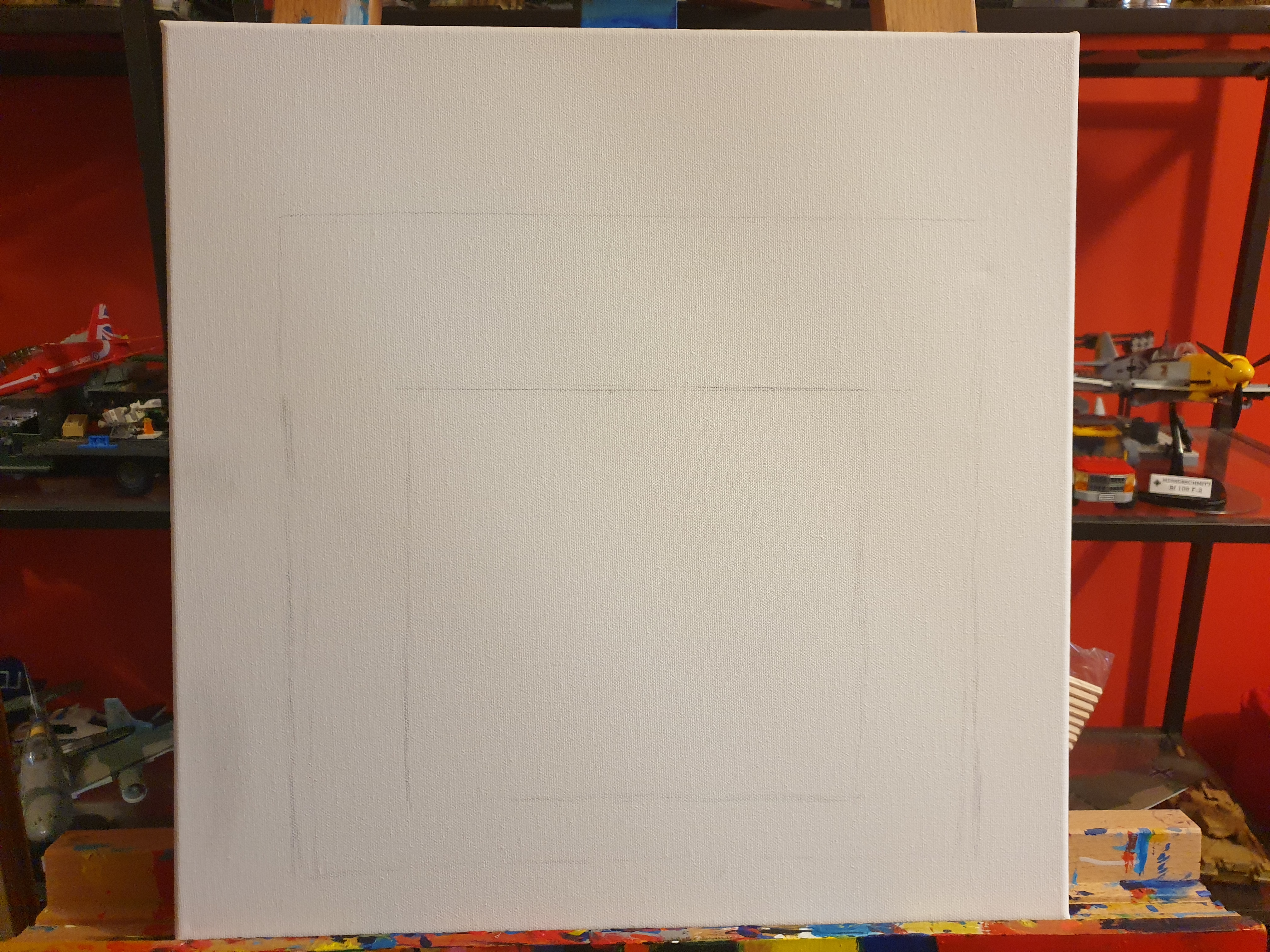
fluorescent yellow drawn out

02
Primary Red (Cass Art), Cadmium Red (Daler Rowney), Cadmium Orange (Cass Art), Fluorescent Red (Daler Rowney). [Acrylic on Canvas]

03
Untitled, (Inspired by HNC Piet Mondrian style painting).

04
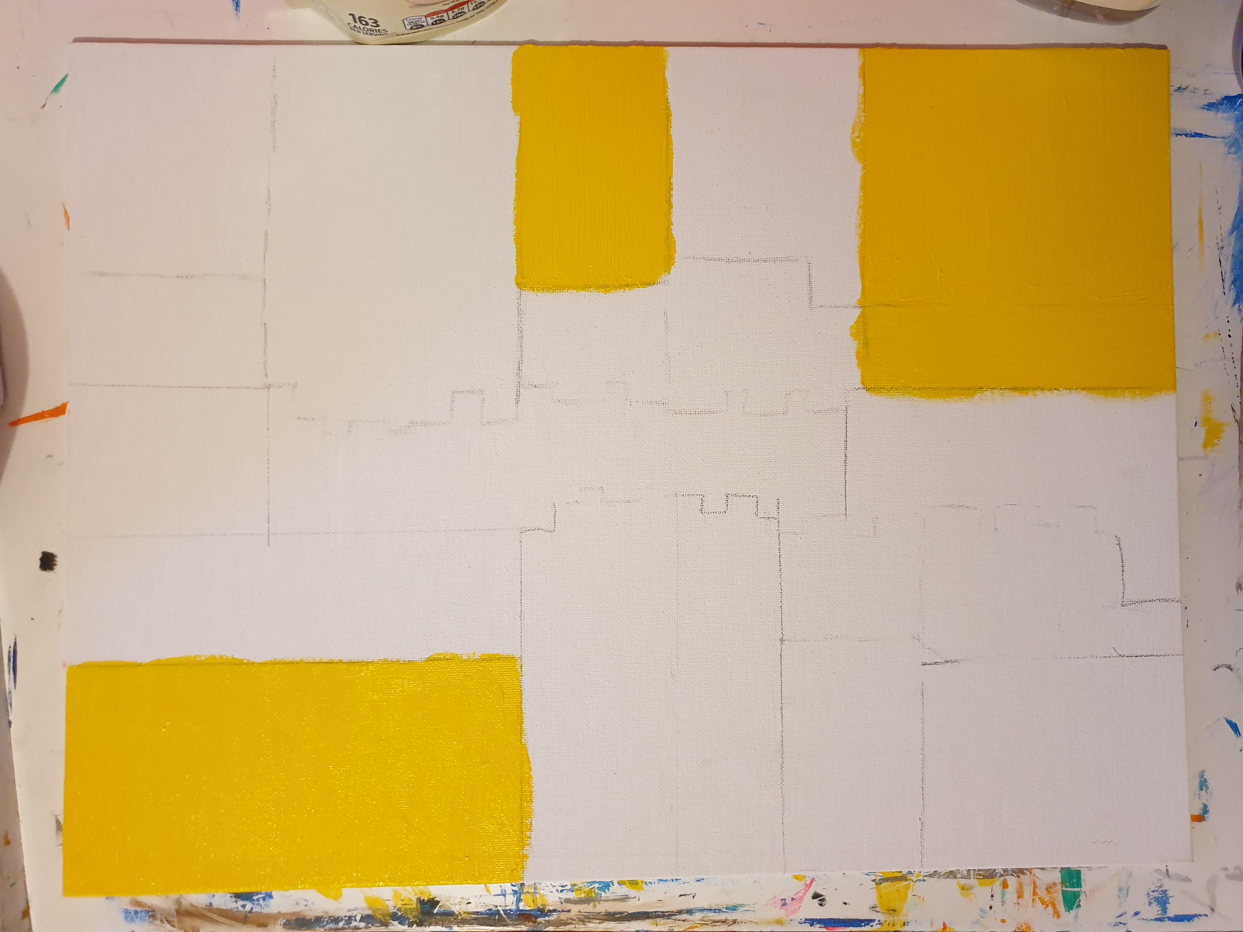
Untitled, (Inspired by HNC Piet Mondrian style painting).

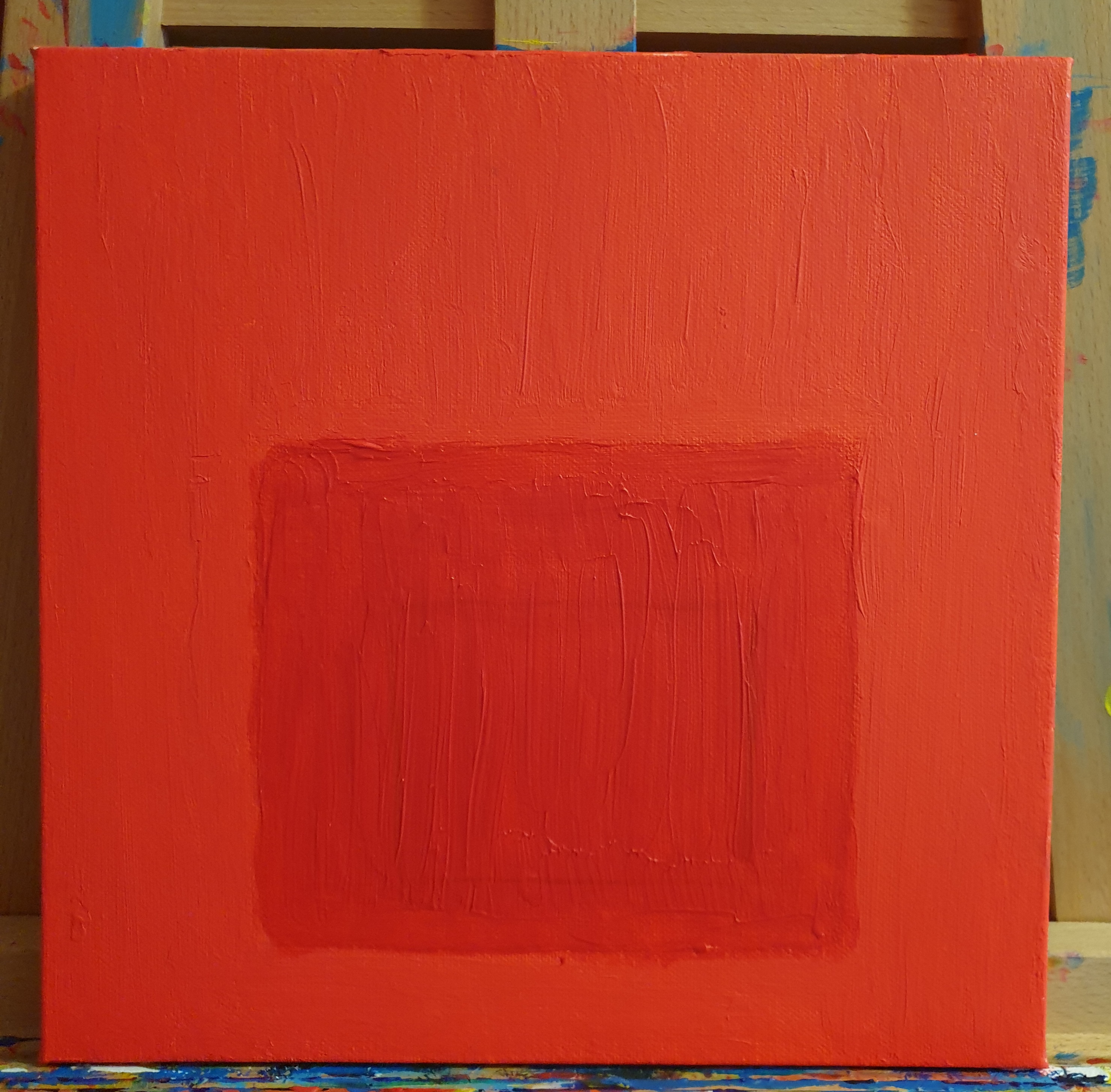
05
Fluorescent Red (Liquitex), Fluorescent Red (daler Rowney).

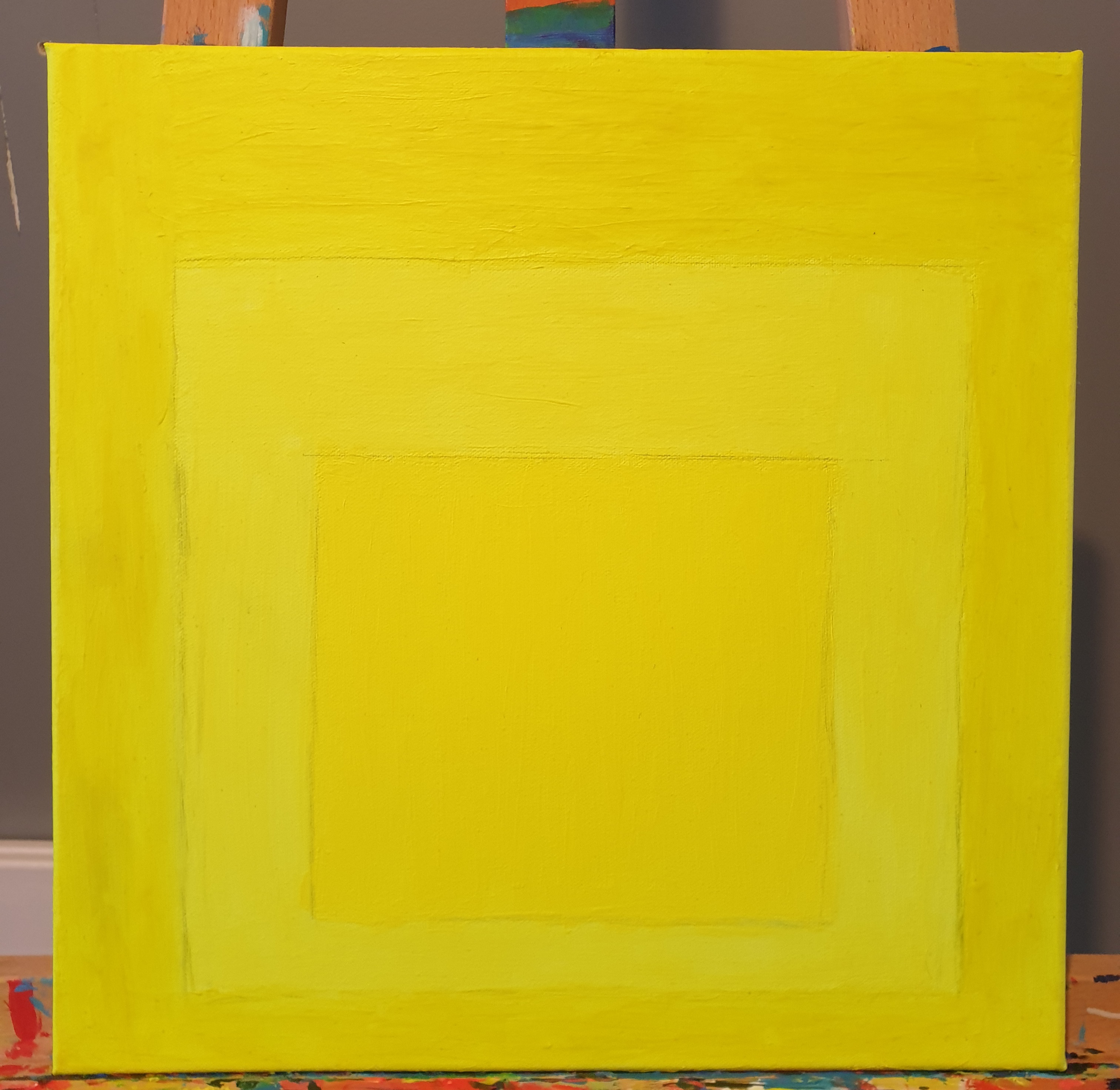
06
Fluorescent yellow (Daler Rowney), Fluorescent Yellow (Pebeo), Fluorescent Yellow (Liquitex).

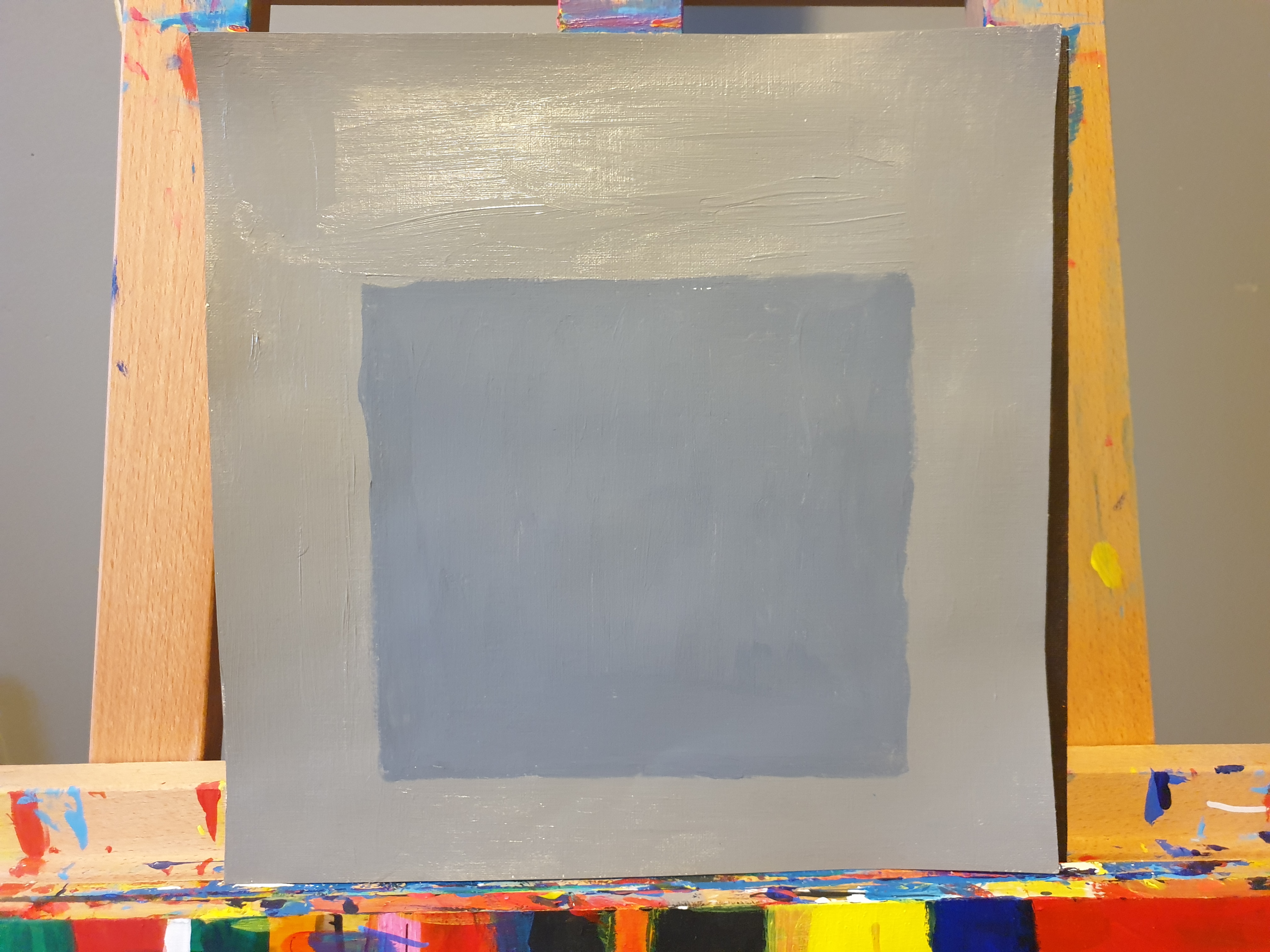
07
Neutral Grey 5 (Liquitex), Neutral Grey (Cass Art).

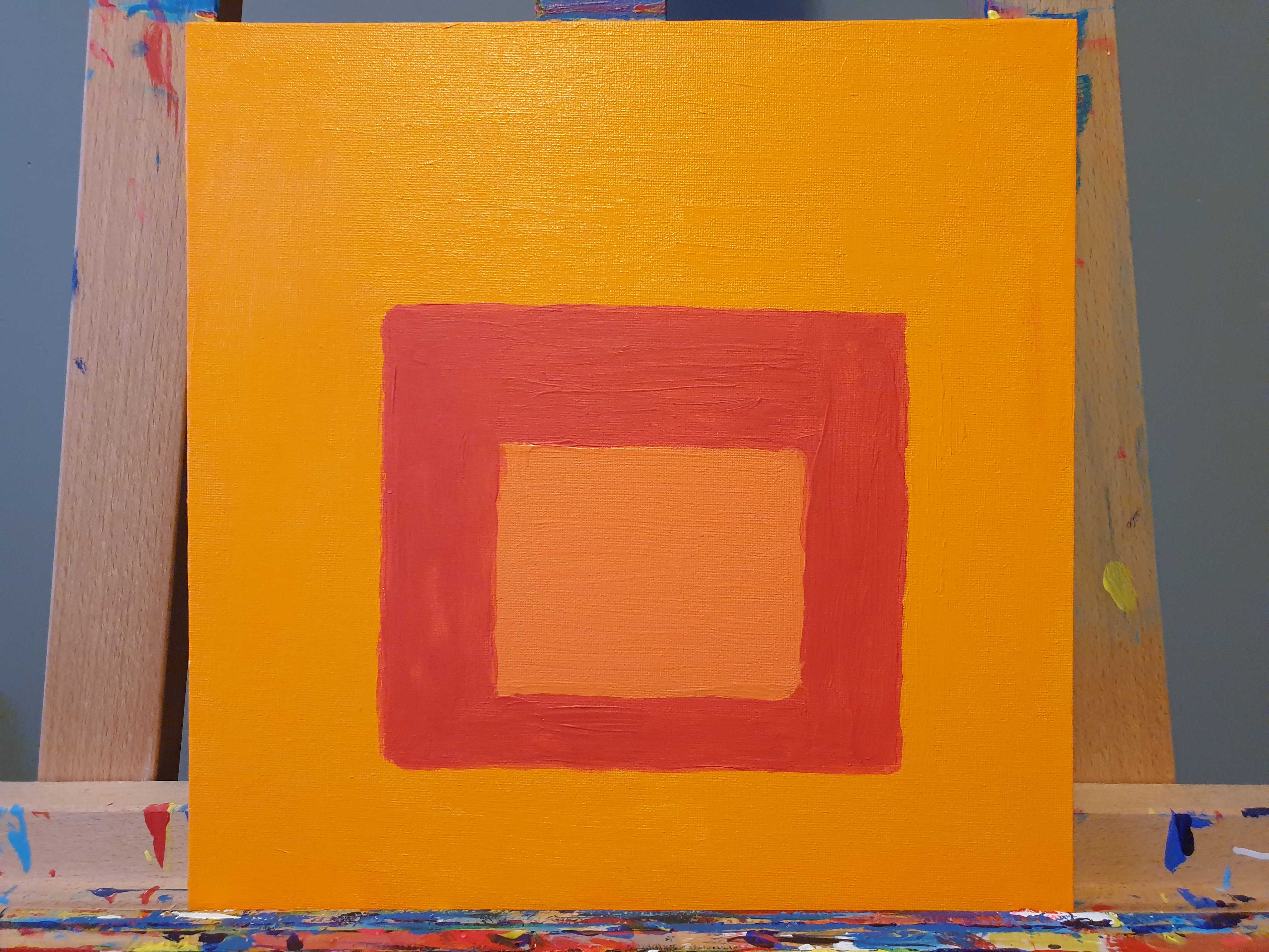
08
Cadmium Orange (Liquitex), Cadmium Red Hue (Cass Art), Cadmium orange Hue (Pebeo).

09
Burnt Umbar (Cass Art), Burnt Umbar (Daler Rowney), Burnt Umbar (Acrylic Colours)
%2C%20Burnt%20Sienna%20(Cass%20Art)%2C%20Burnt%20Sienna%20(Acrylic%20Colours%2C%20Burnt%20Sienna%20(Boldmere)_.jpg)
10
Burnt Sienna (Daler Rowney), Burnt Sienna (Cass Art), Burnt Sienna (Acrylic Colours, Burnt Sienna (Boldmere).

11
Ultramarine (Cass Art), Ultramarine (Daler Rowney), Ultramarine (Boldmere), Ultramarine (Acrylic Colours).

12
Prussian Blue hue Blue de Prusse (Limit) (Daler Rowney), Prussian Blue Hue (Liquitex).

13
Cerulean Blue (Liquitex), Cerulean Blue (Pebeo). (Smith 2025)
%2C%20Leaf%20Green%20(Cass%20Art%2C%20Sap%20Green%20(Daler%20Rowney)%2C%20Leaf%20Green%20(Daler%20Rowney%20Graduate).jpg)
14
Sap Green (Cass Art), Leaf Green (Cass Art, Sap Green (Daler Rowney), Leaf Green (Daler Rowney Graduate)

15
Emerald Green (Daler Rowney) Emerald Green (Liquitex), Viridian (Acrylic Colours), Viridian (Boldmere).
.jpg)
16
(Phthalo Blue (Daler Rowney, Phthalo Blue (Boldmere)
%2C%20Yellow%20Orche%20(Daler%20Rowney)_.jpg)
17
Yellow Orche (Cass Art, Yellow Orche (Boldmere), Yellow Orche (Daler Rowney).

18
Coeruleum Blue hue (Daler Rowney), Coeruleum Blue Hue (Liquitex), Cobalt Blue Hue (Daler Rowney), Cobalt Blue Hue (Daler Rowney Graduate)

19
Lemon Yellow (Daler Rowney) & Lemon Yellow (Shore & Marsh)
%20Brilliant%20Blue%20(Cass%20Art)%20%26%20Brilliant%20Blue%20(Liquitex).jpg)
20
) Brilliant Blue (Cass Art) & Brilliant Blue (Liquitex)

21
Primary Yellow (Daler Rowney Graduate), Primary Yellow (Daler Rowney), Cadmium Red (Cass Art), Cadmium Red (Daler Rowney).
Acrylic on canvas
_.jpg)
22
Fluorescent Yellow (Daler Rowney), lemon Yellow (Daler Rowney), Cadmium Yellow (Cass Art), Cadmium Orange (Cass Art), Cadmium Red (Cass Art) and Primary Red Cass Art).
- fluorescent yellow drawn out
- Primary Red (Cass Art), Cadmium Red (Daler Rowney), Cadmium Orange (Cass Art), Fluorescent Red (Daler Rowney). [Acrylic on Canvas]
- Untitled, (Inspired by HNC Piet Mondrian style painting).
- Untitled, (Inspired by HNC Piet Mondrian style painting).
- Fluorescent Red (Liquitex), Fluorescent Red (daler Rowney).
- Fluorescent yellow (Daler Rowney), Fluorescent Yellow (Pebeo), Fluorescent Yellow (Liquitex).
- Neutral Grey 5 (Liquitex), Neutral Grey (Cass Art).
- Cadmium Orange (Liquitex), Cadmium Red Hue (Cass Art), Cadmium orange Hue (Pebeo).
- Burnt Umbar (Cass Art), Burnt Umbar (Daler Rowney), Burnt Umbar (Acrylic Colours)
- Burnt Sienna (Daler Rowney), Burnt Sienna (Cass Art), Burnt Sienna (Acrylic Colours, Burnt Sienna (Boldmere).
- Ultramarine (Cass Art), Ultramarine (Daler Rowney), Ultramarine (Boldmere), Ultramarine (Acrylic Colours).
- Prussian Blue hue Blue de Prusse (Limit) (Daler Rowney), Prussian Blue Hue (Liquitex).
- Cerulean Blue (Liquitex), Cerulean Blue (Pebeo). (Smith 2025)
- Sap Green (Cass Art), Leaf Green (Cass Art, Sap Green (Daler Rowney), Leaf Green (Daler Rowney Graduate)
- Emerald Green (Daler Rowney) Emerald Green (Liquitex), Viridian (Acrylic Colours), Viridian (Boldmere).
- (Phthalo Blue (Daler Rowney, Phthalo Blue (Boldmere)
- Yellow Orche (Cass Art, Yellow Orche (Boldmere), Yellow Orche (Daler Rowney).
- Coeruleum Blue hue (Daler Rowney), Coeruleum Blue Hue (Liquitex), Cobalt Blue Hue (Daler Rowney), Cobalt Blue Hue (Daler Rowney Graduate)
- Lemon Yellow (Daler Rowney) & Lemon Yellow (Shore & Marsh)
- ) Brilliant Blue (Cass Art) & Brilliant Blue (Liquitex)
- Primary Yellow (Daler Rowney Graduate), Primary Yellow (Daler Rowney), Cadmium Red (Cass Art), Cadmium Red (Daler Rowney).
- Fluorescent Yellow (Daler Rowney), lemon Yellow (Daler Rowney), Cadmium Yellow (Cass Art), Cadmium Orange (Cass Art), Cadmium Red (Cass Art) and Primary Red Cass Art).
bottom of page